BEAUTY BAY, an international cult beauty retailer, was launching its first skincare range for their Gen Z audience and had a mission to extend their own brands.
Launching flexible skincare brand
WHAT I DID
- Brand identity
- UX UI
- Digital marketing
- Packaging design
- Leading the creative team
- Creative directing
ROLE
- Creative lead
- Associate Creative Director
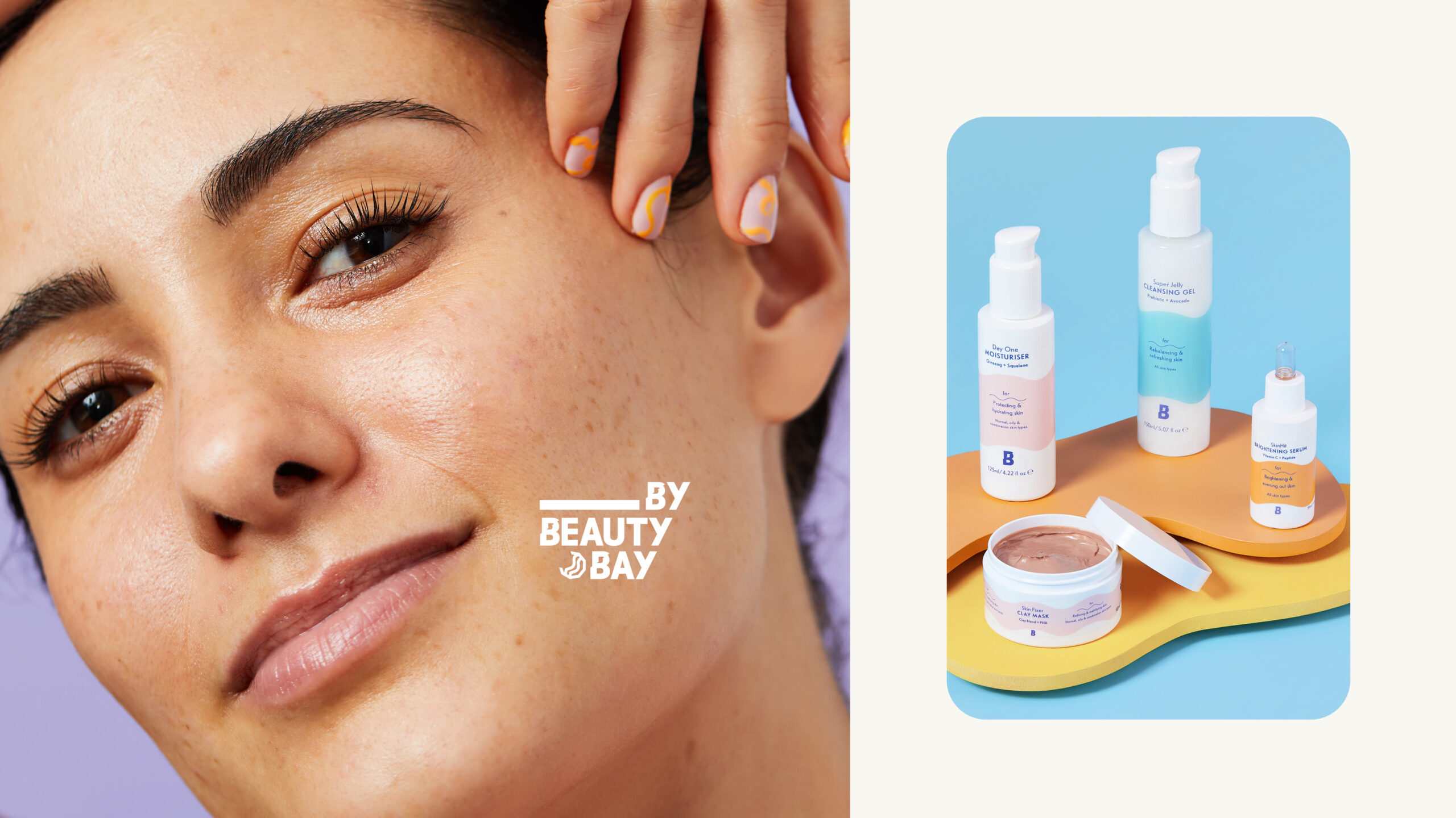
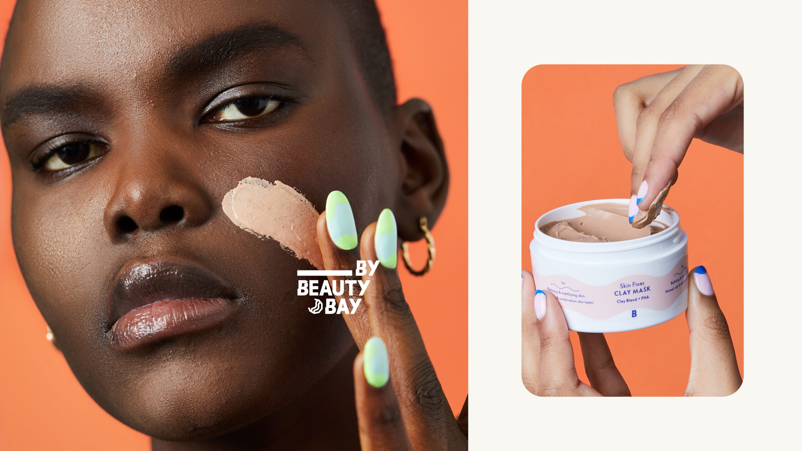
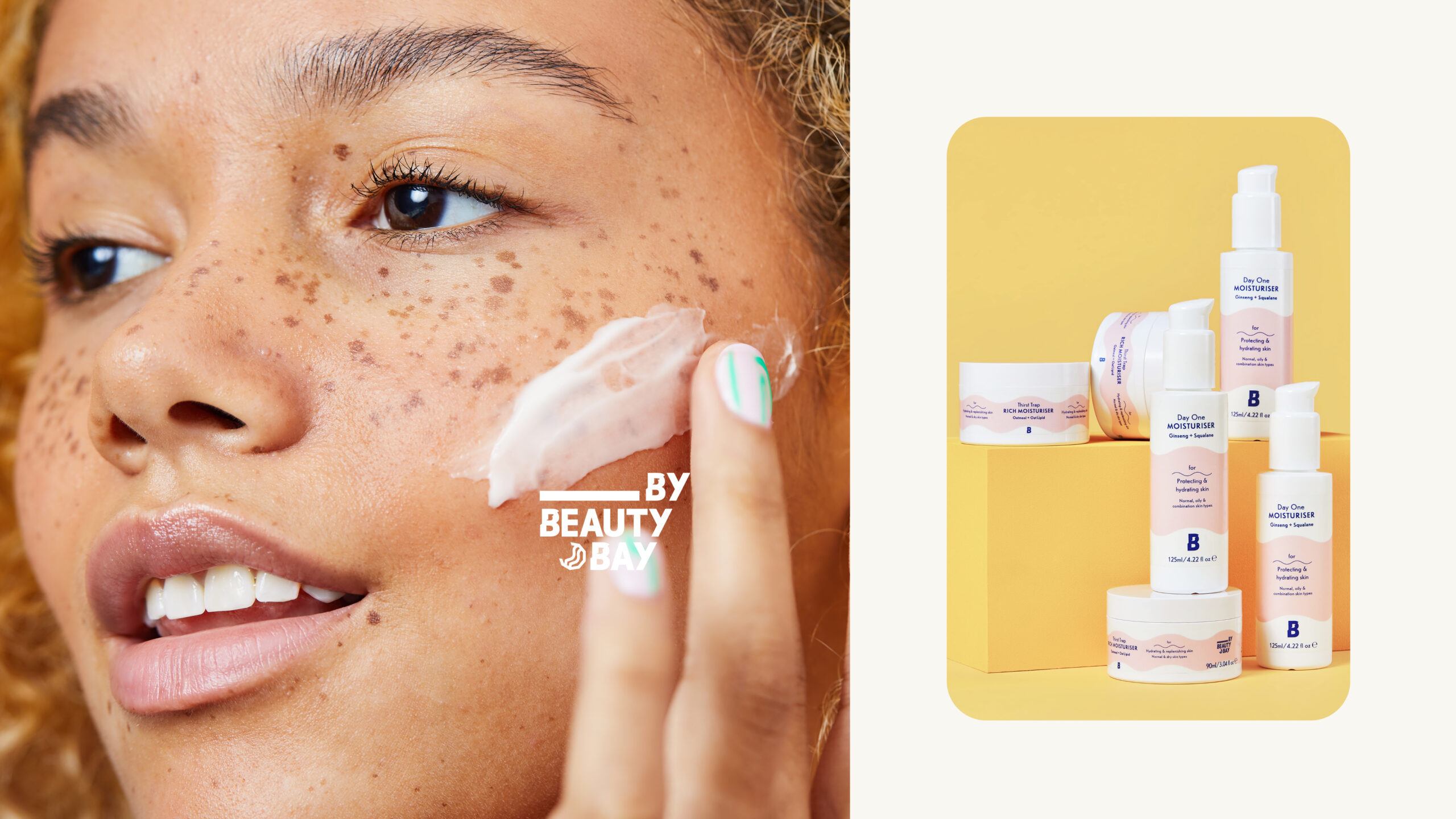
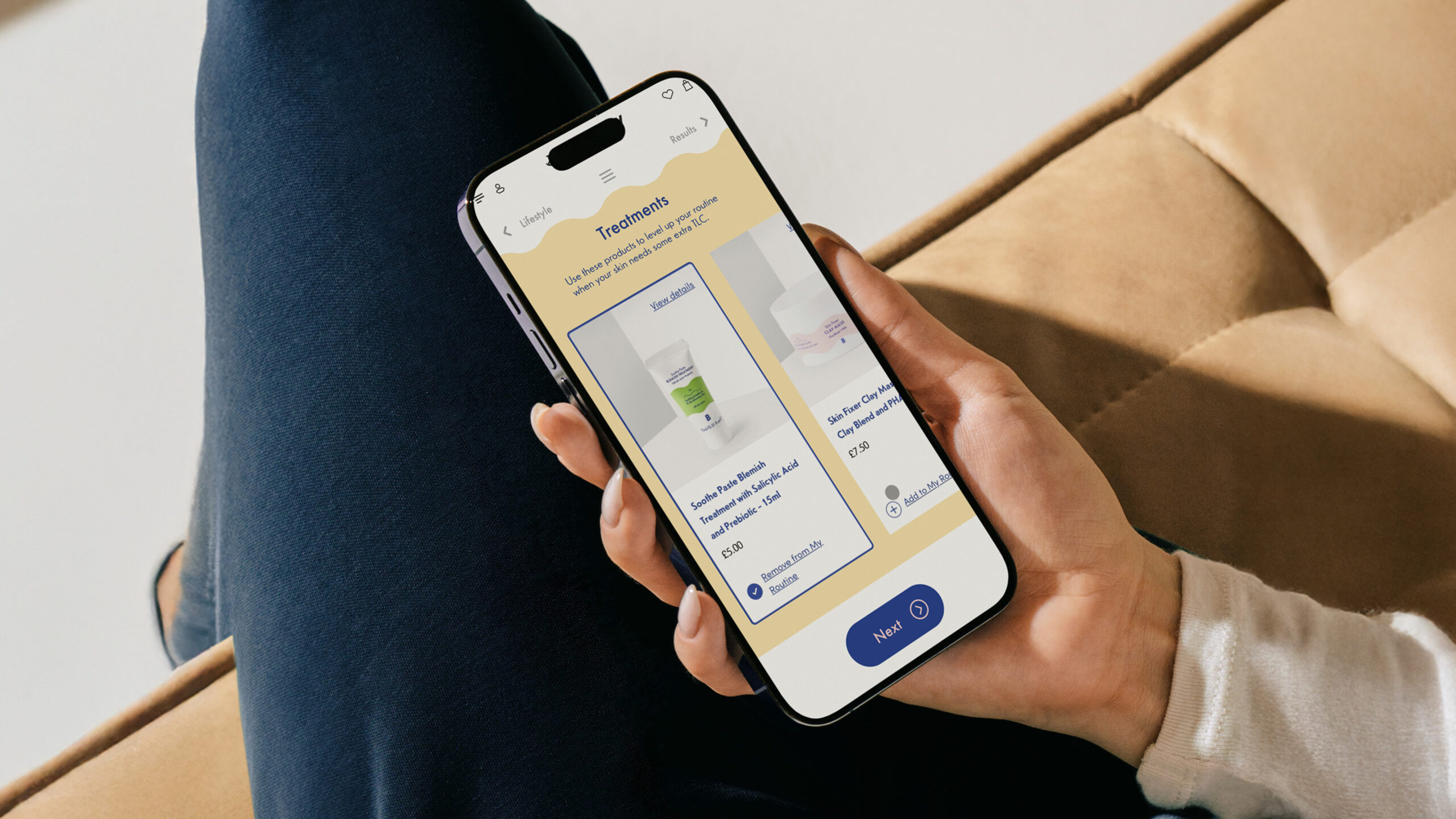
Crafting packaging design for ease of use and accessibility
Packaging is designed to ensure customers can easily understand what the products are, their functions, and how to use them.
Since the products are exclusively sold online, we made the key details easily accessible within the packaging itself, so users can quickly find what they need without having to go back online.
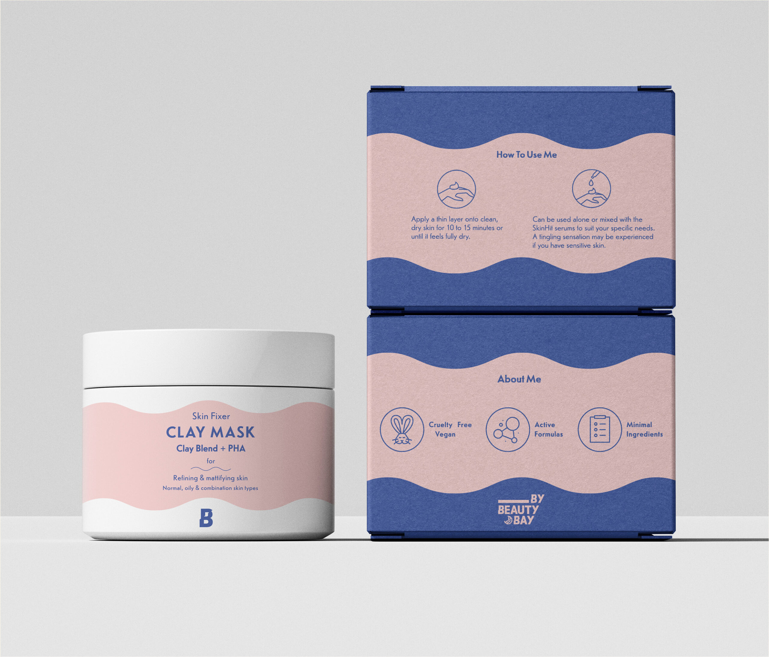

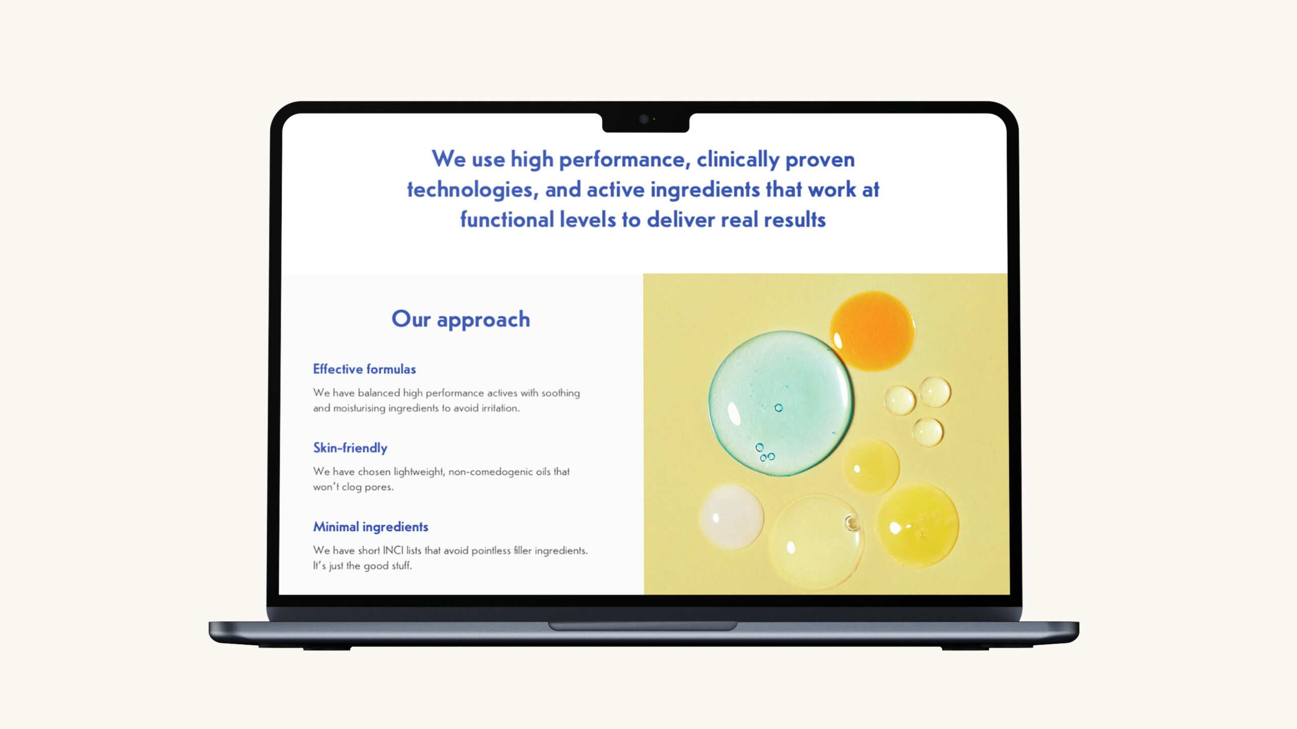
Using colours to group
product functionalities
The colour system allows for an intuitive understanding of how & when to use each product simply by looking at the packaging.
This system also supports future product line extensions, allowing new additions to seamlessly fit into the existing structure while maintaining a cohesive design.
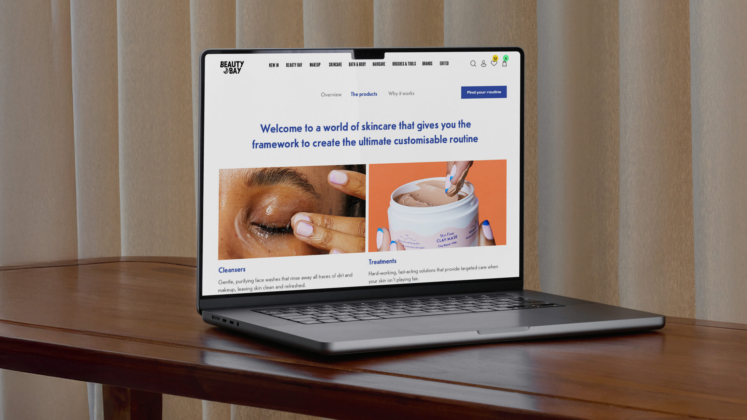
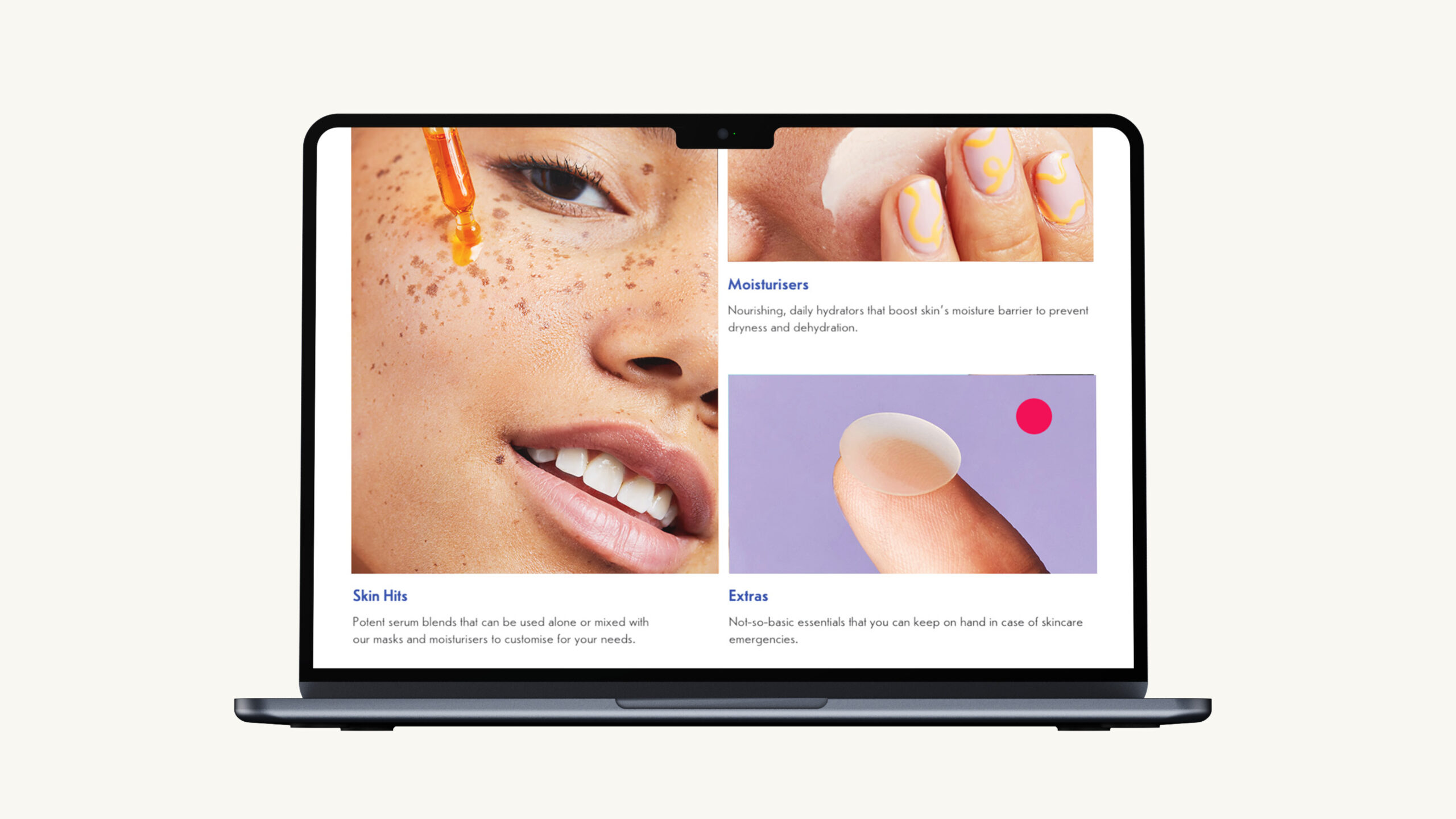
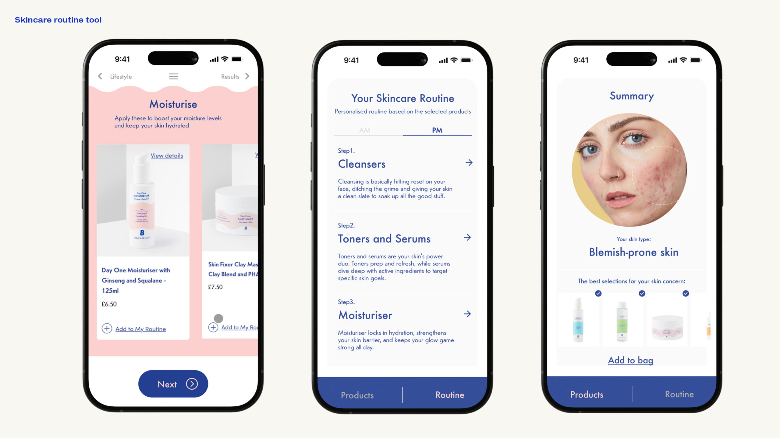
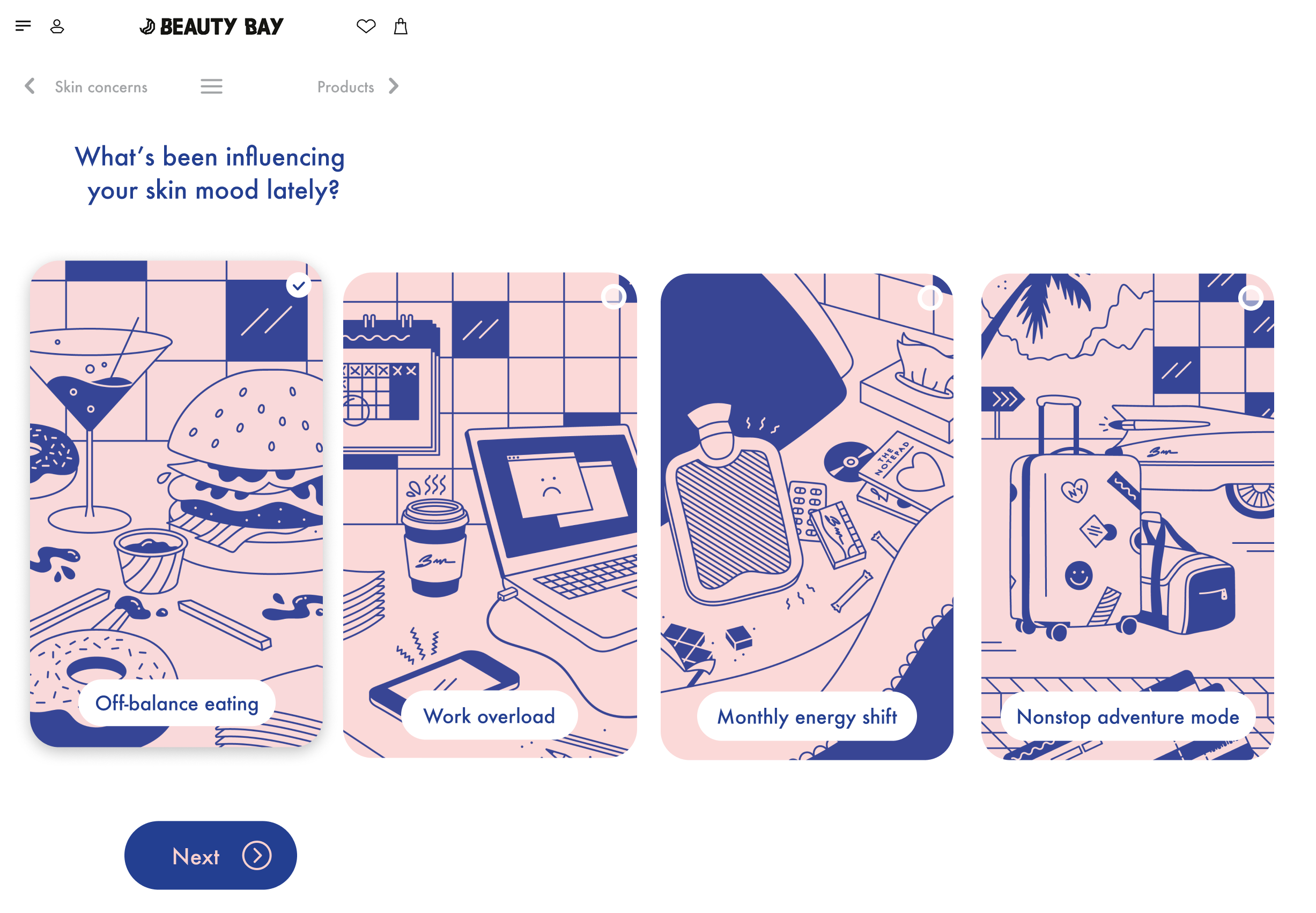
Using engaging
illustrations to simplify information
TCommissioned lifestyle visuals to replace dense content. Balanced clarity and humour for a more intuitive and engaging experience.